Project 03 / 3
Field Notes
Editorial layout and typography
The challenge
Field Notes is a concept for a short design journal. The challenge was to balance long-form reading, short captions, and visual pauses while keeping the publication consistent from spread to spread.
My contribution
Editorial layout and typography
The decisions
I built a two-column reading grid with a separate caption zone. Large section numbers create orientation without interrupting the body copy. Pull quotes are used only when they add meaning rather than repeat the paragraph beside them.
The evidence
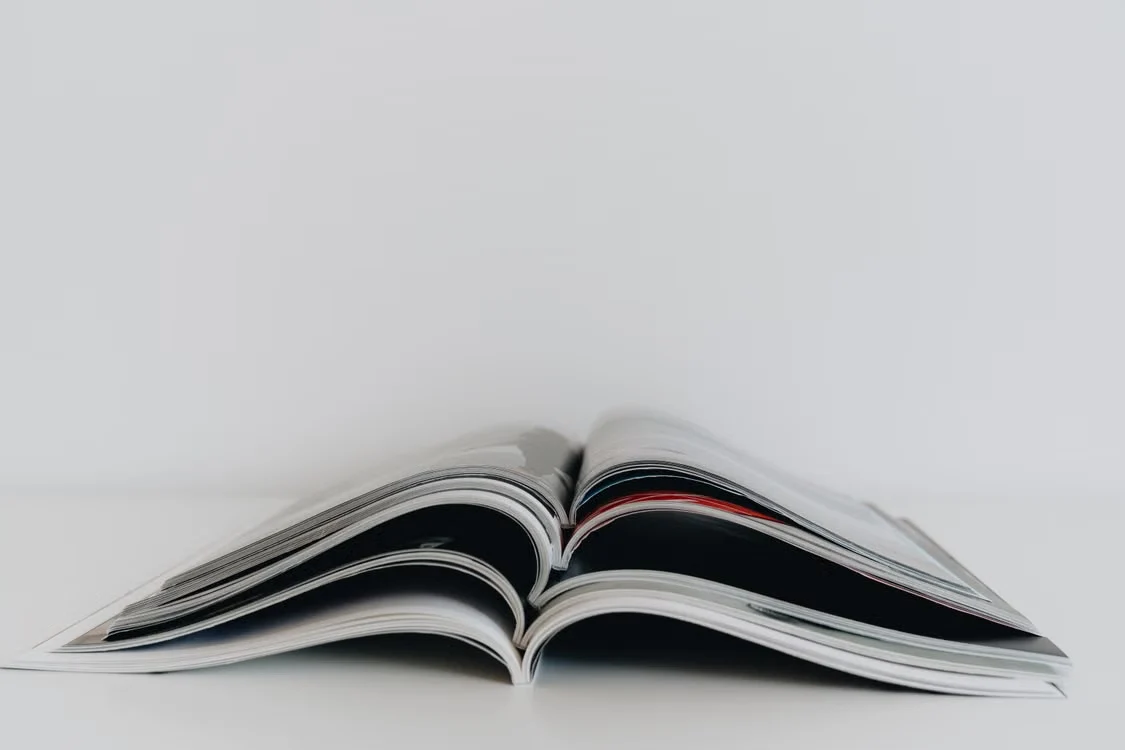
The proposed spread uses a consistent grid and type hierarchy. The magazine photograph is stock reference, not a publication designed by this candidate. A production check would verify line length, font licensing, print margins, and image resolution.
The outcome
The deliverable is a cover and editorial spread concept with reusable spacing and type rules. It is not a published magazine or a claim of client experience.
Limits and next steps
Consistency makes the reader comfortable enough to notice the moments that break the pattern.
The next conversation
Let’s make something useful.
Your approved contact links go here. This fictional candidate cannot be contacted.